Many of the images that were hung on the wall were of some form of civilization with nature surrounding it. The image that struck me the most was of an abandoned gas station, but the lights in the vending machine were still working. There was also an image of an obviously abandoned road but the traffic lights were still working. The images that he hung on the wall were mainly nature in the environment but the images he showed us on the slideshow were more of people and interviews. Robert Knoth risked his health by going to this place to document how these people have suffered and continue to suffer. If it weren't for someone like him who is willing to risk his health to show the world what is happening, most of us would have never heard about this tragic event. I find it really inspiring as someone who would love to be a photo journalist to know that by taking pictures you can cause social change to help people who are in need and who have a hard time getting their voice heard. I really enjoyed this event and would love to see more of his work and want to keep up with this terrible tragedy.
Monday, May 5, 2014
Art Event- 1/28 Robert Knoth and Greenpace
The event that I attended in the Boyden gallery was towards the beginning of the semester and it was a gallery talk. It featured Robert Knoth who talked to us about his project and showed us a slide show of his images that he took. He works for a company called greenpeace and the project he did was called Shadowlands. What he did was he went to Fukushima in Japan where there was a nuclear disaster and captured how peoples lives have changed. He showed us his documentary and had some videos of people and many images and talked to them about how their daily lives have changed and the horrible conditions that they are living in. Most people had to leave their homes and move to different places until their homes were safe, but many have not been able to move back home because there is nothing left of their homes. They are living in terrible conditions and even the water they have to bathe in is harmful to them. Robert Knoth captured images that showed the beauty of what used to be Fukushima and how the nuclear disaster has changed it.
Many of the images that were hung on the wall were of some form of civilization with nature surrounding it. The image that struck me the most was of an abandoned gas station, but the lights in the vending machine were still working. There was also an image of an obviously abandoned road but the traffic lights were still working. The images that he hung on the wall were mainly nature in the environment but the images he showed us on the slideshow were more of people and interviews. Robert Knoth risked his health by going to this place to document how these people have suffered and continue to suffer. If it weren't for someone like him who is willing to risk his health to show the world what is happening, most of us would have never heard about this tragic event. I find it really inspiring as someone who would love to be a photo journalist to know that by taking pictures you can cause social change to help people who are in need and who have a hard time getting their voice heard. I really enjoyed this event and would love to see more of his work and want to keep up with this terrible tragedy.

Many of the images that were hung on the wall were of some form of civilization with nature surrounding it. The image that struck me the most was of an abandoned gas station, but the lights in the vending machine were still working. There was also an image of an obviously abandoned road but the traffic lights were still working. The images that he hung on the wall were mainly nature in the environment but the images he showed us on the slideshow were more of people and interviews. Robert Knoth risked his health by going to this place to document how these people have suffered and continue to suffer. If it weren't for someone like him who is willing to risk his health to show the world what is happening, most of us would have never heard about this tragic event. I find it really inspiring as someone who would love to be a photo journalist to know that by taking pictures you can cause social change to help people who are in need and who have a hard time getting their voice heard. I really enjoyed this event and would love to see more of his work and want to keep up with this terrible tragedy.
Monday, April 14, 2014
Web Designer Artist Post- Mike Kus
Mike Kus is a designer from the UK who specializes in WEB/UI design, graphic design, branding, illustration, and photography. He has a worldwide client roster and his work is regularly featured in design related publications. He has been working in the creative industries for 15 years. He is known for creating web designs that seamlessly marries form and function. His work has been featured in many design books and magazines and he regularly speaks at design and web conferences across the world. He has designed works for the likes of twitter, Microsoft, berocca and mailchimp and many more. He really likes to take pictures and share them on instagram.


https://twitter.com/mikekus
Going through Mike's work is really interesting because he has such a broad range of what he does. Obviously if he is designing a website for another company he has to do what they tell him to do but his work has some sort of consistency. Most of the websites he designs he illustrates by hand the imagery so that there is a handmade aesthetic to it. It seems like he likes to use lots of illustrations and images in his work and has a eye-catching yet simple feel to them. One site he even does a "two color per page" theme where he has a foreground color and a background color. I really enjoy this because it is easy for the eye to navigate around the page.
Mike even did some of his own little illustrations for the Olympics in 2012 in London. He played with the idea of likening the athletes abilities to that of animals with legendary abilities in the same area. I thought this was really neat because he used the same type of hand made illustrations that you see throughout his websites. I really like his work because it is very colorful and artsy yet it is very simple and easy to look at. Even his website is artsy and fun but easy to navigate. He definitely has a style which he sticks to which is using illustrations and color in a simple manner. I think this style might not be as effective if someone were trying to make a web design for a serious company or something that shouldn't be so artsy. But for my interest and for what I am looking into, I really admire his work and his style.
Thursday, March 27, 2014

Monday, March 24, 2014

Thursday, March 6, 2014

Thursday, February 27, 2014


Tuesday, February 25, 2014

Artist Post- Pascal Dombis
Pascal Dombis

Pascal Dombis is a digital artist who uses computers and algorithms to produce a lot of repetition of simple processes. He has been doing this for twenty years and uses geometrical or typographical sign. Dombis lives and works in Paris and earned his engineering degree from Insa University in Lyon. He started using computers in 1987 at Tufts University where he took computer art classes. He is noted for his excessive use of simple algorithmic rules. Dombis originally worked with simple rules like drawing a straight like. Then he used digital tools to make visual forms appear, but still by using these simple rules. He does not have a structure made up in his mind in advance, he uses simple rules and lets them go through a series of interactions.

RightRong, 2007-2012

Géométries Irrationnelles, 2008 / Galerie Municipale, Vitry sur seine, FR

Mixed_Grill(e), 2014
Eurasia, 2012
Pascal Dombis uses lines and shapes and words and repeats them many times and puts them in a interesting way. I really like the way he uses line because it makes you want to continue to look at his images. Sometimes I feel like artists use way too much and can go overboard when making an image but I really like his work because he does go overboard. But the way he does too much makes it interesting and he does it in a way that is not "too much". Most of his works he uses many layers to make it look like it is 3D. I have no idea how he does this but it is very interesting. The video I have above is of a floor that he put thousands of layers of words and phrases and it looks 3D. The person in the video touches the floor to show you it is not 3D but really one image.
I think it is amazing how he can trick your eye just by putting multiple layers of one graphic together. I feel like if you really look at his work there is no true composition, but as a whole there is definitely a great composition. I feel like because he uses so many layers, he keeps your eye into his artworks. It is probably impossible to see every little thing in his work but it is cool to try to look at all of the different layers. He also has many deep meanings to his work and why he does certain things. The only one that I found a meaning for was the first image I have of his called RightRong. In the image it shows over and over again the words "I am right, you are wrong". He says he did this to try to show that no one is ever truly right or wrong. I'm sure there is meaning to all of his art and it would be interesting to know what each thing means. I also think knowing that his work has meaning just makes it that much better.
I think it is amazing how he can trick your eye just by putting multiple layers of one graphic together. I feel like if you really look at his work there is no true composition, but as a whole there is definitely a great composition. I feel like because he uses so many layers, he keeps your eye into his artworks. It is probably impossible to see every little thing in his work but it is cool to try to look at all of the different layers. He also has many deep meanings to his work and why he does certain things. The only one that I found a meaning for was the first image I have of his called RightRong. In the image it shows over and over again the words "I am right, you are wrong". He says he did this to try to show that no one is ever truly right or wrong. I'm sure there is meaning to all of his art and it would be interesting to know what each thing means. I also think knowing that his work has meaning just makes it that much better.
Monday, February 10, 2014
Artist Post- Alberto Seveso
Alberto Seveso was borin in Milan, Italy in 1976 and started doing artwork in 1990. He decided to go into graphic design and photography because he was fascinated with skate decks and the cover of CD's from metal bands. He never went to an art school and is completely self taught. He started with using Deluxe Paint and Photoshop and was also a street artist. He then moved to Rome where he began his career as a graphic designer/illustrator. He has spent some time experimenting with high speed photography and ink.


I really enjoy his work because I am really into photography and specifically portrait photography. In high school I did a project with ink and water so that was another thing that I have in common with him. I have never experimented with portrait photography and photoshop the way he does and I am really interested in trying something like this. I am not sure what the actual meaning of his work is but it seems like he is just having fun and finding a new way to make portrait images. He uses lots of color and shapes and makes you question whats real and what is fake. Sometimes the faces are almost completely unrecognizable and sometimes you can see the entire face like the top picture.
Bon Expose
Alberto Seveso Official Web Page


His work seems to be mainly portraits and also ink. He uses lots of color and other images to put into portraits to transform the face. He makes it seem like the face is made out of something else. In the top picture he uses his ink photography as hair for the woman. The second one seems to be more a floral and linear design. The third one is just ink and the fourth is also a portrait with what looks like just different splats of color and ink in the background. Most all of his pictures are very colorful with a dark background. I really like what he does and it makes the faces almost unrecognizable but you can still see the eyes and basic facial form. It really makes you look deeper into the picture to see what all is in there. It is almost impossible to see everything at times and kind of hurts my eyes but I enjoy looking at them.
Bon Expose
Alberto Seveso Official Web Page
Wednesday, February 5, 2014

Tuesday, February 4, 2014
SCANS
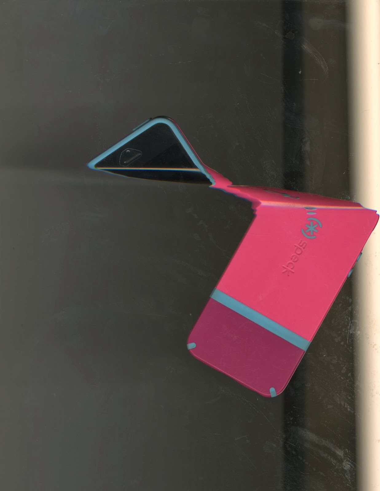
1. Phone

2. CD's

3. Unicorn Confetti

4. CD and Confetti

5. Keys
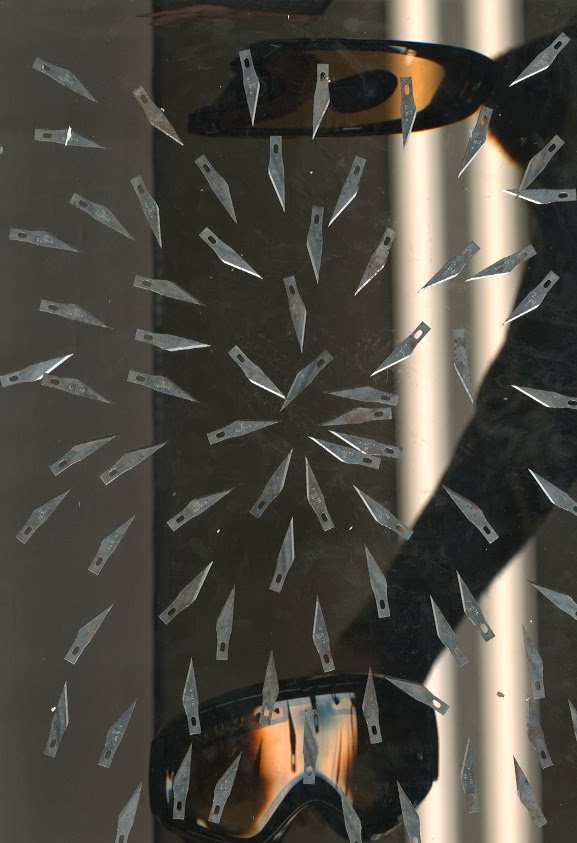
6. Knifes and Goggles

7. Knifes

8. Knifes and Unicorn
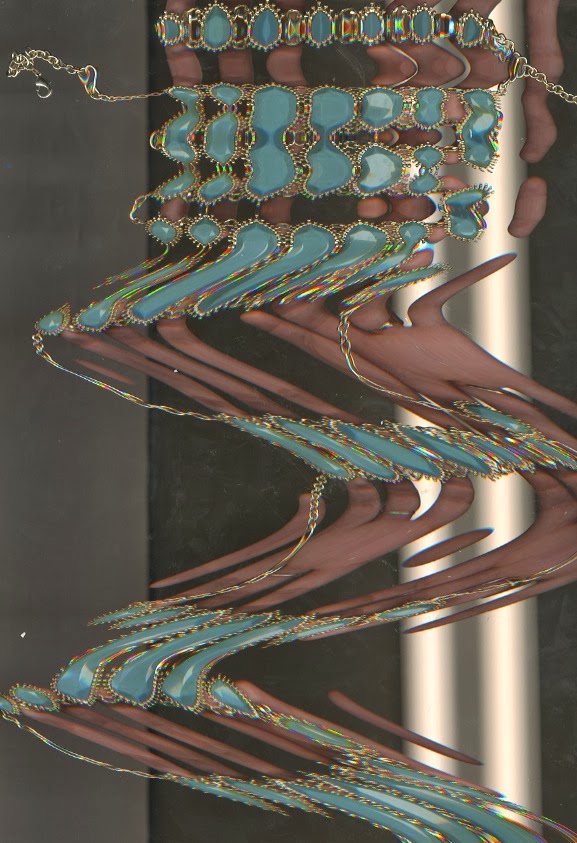
9. Necklace

10. Goggles
Wednesday, January 29, 2014
24 Hour Technology Log
Saturday Jan. 25th
1. Looked at phone as soon as I got up and checked Facebook and my email
2. Watched T.V. for a couple hours
3. Used the microwave and stove to make breakfast
4. Played with phone while eating
5. Used TV to workout
6. Checked phone
7. Watched Netflix for a while
8. Used my phone to text friend
9. Used ipod to listen to music while showering
10. Used stove to make dinner
11. Called friend on phone
12. Drove car
13. Used debit card
14. Checked phone
15. Used ipod for music
16. Texted friend
17. Checked phone
18. Used phone a lot more for music for couple hours
19. Watched Netflix
20. Checked phone
21. Had TV on
22. Set Alarm
I use my phone way too much apparently.
Monday, January 27, 2014
Nancy Burson

Androgyny (6 men and 6 women) 1982

Cog and Dat 1983

Human Race Machine

Special Faces 1991-93
Nancy Burson is an artist/photographer who combined art and innovation in a way that challenged photographic truth using digital manipulation. She is the first person to use technology that allows you to age a person's face that law enforcement use to identity missing children and adults. She also has a human race machine that allows people to view themselves as a different race. She has many projects for example combining boys and girls faces and even animals to make one image. All of her work promotes the concept of global unity and is shown in museums and galleries internationally. She is currently teaching "vision and style" at the New York Film Academy in NYC.
I am really interested in Nancy Burson's work mainly because I am into photography and more specifically portraits. All of her work is based on the concept of global unity and it is very obvious to notice. She takes pictures of men and women and combine them and she also takes pictures of celebrities and combine them I'm guessing to play on what people think of as the most attractive human. I think even just looking at her work you can tell how much thought went into what she was doing and reading the descriptions only make it stronger. Some of her work is not as distorted and are of children whose faces are altered with diseases or other issues and ask us to reconsider what we consider to be beautiful.
I feel like her work is very simple and not as complex as other artists but I think this makes her work stronger. If she had focused on other aspects of the person rather than just the face like she usually does I don't think it would have sent the same message. I really like that her work sends a global message that I think everyone can agree with. I think her strongest work would have to be the Human Race Machine. The message that we as humans should move beyond our differences and that we are all one race, the human one, is still something that people need to realize to this day. The way she is showing this message through her artwork is very inspiring and I don't think theres anything that I dislike about her work.
Links to artworks and citations:
Subscribe to:
Comments (Atom)